Theme-switcher with Rails, Stimulus, ActionCable, and Flowbite
Let’s create a theme switcher that supports three states (light, dark, system default), persists both in localStorage and server-side, and instantly updates every open tab, using Rails, Stimulus, ActionCable, and Flowbite.
Desired outcome
A theme-switcher button with a dropdown, offering three choices: light theme, dark theme, and the system default. Light and dark keeps the selection, while system follows the system-wide settings: once that’s changed, the page automatically adjusts to the new settings. Additionally, the choice is persisted in localStorage and – if the user is logged in – in their profile server-side. For bonus points, if the user is logged in, changing the settings in one browser (or one browser tab) should change the theme in all open tabs of the site, in all browsers, instantly, without page reload.
Color-changing icon
I use Flowbite, which manages light and dark theme colors with CSS variables. This way, instead of bg-white dark:bg-gray-950 I can use bg-neutral-primary, which will be white in light mode and gray-950 in dark mode. This feature halves the number of utility classes needed for each element, neat! CSS variables can also be used in SVG icons, making them change their color automatically upon theme change. I needed to define two colors for this to work: one for the border and the right side of the icon (gray-900 in light mode, white in dark mode), and one for the left part (white in light mode, gray-900 in dark mode). Fill colors can be defined on SVG paths as well as on the SVGs themselves, so the result is this:
<svg class="fill-heading" viewBox="..."><path d="..." class="fill-neutral-primary-soft"/><path d="..."/></svg>The first path uses its own fill color, while the second one uses the color defined on the SVG.
After some fiddling, the theme switcher icon looks like this in action (although its size is much smaller):
 A subtle thing I like is that in each mode it also shows the transition that’s about to happen: in light mode the icon is white (left part) to black (right part), in dark mode it’s black to white. Although I’ll have to provide a mirrored icon once I start supporting RTL languages!
Theme switcher dropdown
With the button out of the way, a dropdown menu is also necessary to provide a list of choices. I opted for a group of radio buttons because
- the browser manages the state and also enforces that a single option is selected at any given time
- styling is quite a lot easier with Tailwind’s
peer-checkedutility.
<ul>
  <li>
    <input type="radio" id="theme-light" name="theme" value="light" class="hidden peer" required />
    <label for="theme-light" class="peer-checked:text-heading peer-checked:bg-neutral-quaternary peer-checked:stroke-[2.5] ...">
      <svg ... >
        <path ... />
      </svg>
      Label
    </label>
  </li>
  ...
</ul>
Logic
The theme switcher has to deal with the following:
- browser- or OS-level color scheme settings and their changes
- theme preferences saved in localStorage from earlier visits
- theme preferences saved in a user’s profile if they are logged in
- resolution of their contradictions
The priority of the various options is simple:
- if the user is logged in, the theme settings in their profile override everything else
- if they are not logged in, a theme setting saved in localStorage overrides the browser setting
- if no theme is saved in localStorage, use the browser default
Javascript
There are three parts of the Javascript code: a short one in the <head> to prevent FOUC (flash of unstyled content), a Stimulus controller to deal with the theme selector and the browser color scheme settings, and an ActionCable script that provides real-time capabilities. This last one will have its own chapter later on; let’s deal with the first two.
The piece in the <head> is a bog-standard one:
<script>
 if (
   localStorage.getItem('theme') === 'dark' ||
   (!('theme' in localStorage) &&
    window.matchMedia('(prefers-color-scheme: dark)').matches)
 ) {
   document.documentElement.classList.add('dark');
 }
</script>
There’s usually an else clause where the dark class is removed from the <head> element if the condition isn’t met, but that dark class is only present there in one case: the user is logged in, and their preference is dark mode. If we removed it from the class list with this script, then it’d be added back with the other script (shown below), causing the FOUC we set out to prevent.
The other script is a Stimulus controller handling the initial setup of the page, as well as theme changes initiated by the user or the browser/OS.
// app/javascript/controllers/theme_controller.js
import { Controller } from "@hotwired/stimulus"
import { patch } from "@rails/request.js"

export default class extends Controller {
    static targets = [ "light", "dark", "system", "systemSvgLight", "systemSvgDark" ]
    static values = { theme: String, url: String }

    static get shouldLoad() {
        let storage;
        try {
            storage = window["localStorage"];
            const x = "__storage_test__";
            storage.setItem(x, x);
            storage.removeItem(x);
            return true;
        } catch (e) {
            document.getElementById("theme-button")?.remove();
            document.getElementById("theme-tooltip")?.remove();
            document.getElementById("theme-dropdown")?.remove();
            return false;
        }
    }

    connect() {
        this.boundHandler = this.#handleEvent.bind(this);
        window.matchMedia("(prefers-color-scheme: dark)").addEventListener("change", this.boundHandler);

        if (this.hasThemeValue) {
            switch (this.themeValue) {
            case "light":
                localStorage.setItem("theme", "light");
                this.lightTarget.checked = true;
                break;
            case "dark":
                localStorage.setItem("theme", "dark");
                this.darkTarget.checked = true;
                break;
            default:
                localStorage.removeItem("theme");
                this.systemTarget.checked = true;
            }
        } else {
            if (!("theme" in localStorage)) {
                this.systemTarget.checked = true;
            } else if (localStorage.getItem("theme") == "light") {
                this.lightTarget.checked = true;
            } else if (localStorage.getItem("theme") == "dark") {
                this.darkTarget.checked = true;
            } else {
                localStorage.removeItem("theme");
                this.systemTarget.checked = true;
            }
        }
        this.#updateDocument();
    }

    disconnect() {
        window.matchMedia("(prefers-color-scheme: dark)").removeEventListener("change", this.boundHandler);
    }

    toggle(event) {
        switch (event.target.value) {
        case "light":
        case "dark":
            localStorage.setItem("theme", event.target.value);
            break;
        default:
            localStorage.removeItem("theme");
        }
        this.#updateDocument();
        this.#updateServer(event);
    }

    #updateDocument() {
        if (
            localStorage.getItem("theme") === "dark" ||
                (!("theme" in localStorage) &&
                 window.matchMedia("(prefers-color-scheme: dark)").matches)
        ) {
            document.documentElement.classList.add("dark");
        } else {
            document.documentElement.classList.remove("dark");
        }
        if (window.matchMedia("(prefers-color-scheme: dark)").matches) {
            this.systemSvgLightTarget.classList.add("hidden");
            this.systemSvgDarkTarget.classList.remove("hidden");
        } else {
            this.systemSvgLightTarget.classList.remove("hidden");
            this.systemSvgDarkTarget.classList.add("hidden");
        }
    }

    async #updateServer(event) {
        if (this.hasThemeValue) {
            await patch(this.urlValue, {body: JSON.stringify({ profile: {theme: event.target.value}}), responseKind: "json" });
            switch (event.target.value) {
            case "light":
            case "dark":
                this.themeValue = event.target.value;
                break;
            default:
                this.themeValue = "system";
            }
        }
    }

    #handleEvent(event) {
        if (event.matches) {
            this.systemSvgLightTarget.classList.add("hidden");
            this.systemSvgDarkTarget.classList.remove("hidden");
        } else {
            this.systemSvgLightTarget.classList.remove("hidden");
            this.systemSvgDarkTarget.classList.add("hidden");
        }

        if ("theme" in localStorage) return;

        if (event.matches) {
            document.documentElement.classList.add("dark");
        } else {
            document.documentElement.classList.remove("dark");
        }
    }
}
Let’s see what we’ve got here.
In addition to the usual Stimulus controller import, we’ll also need patch from request.js – we’ll use it to update the logged-in user’s theme setting on the server. More about this later.
There are targets for the radio buttons (light, dark, system), and also for the two SVGs for the system theme setting (more on that later as well). The values are only present if the user is logged in, and hold their current theme and the update URL, respectively.
The shouldLoad method allows us to prevent the loading of this controller if certain conditions aren’t met – in our case, if localStorage isn’t available, there’s no point in displaying a theme changer, since the user won’t be able to use it. So we check the availability of localStorage, and if we succeed, return true – the controller can be loaded. If we fail, we remove the theme changer elements from the page and return false – the controller won’t be loaded.
In the connect method, we add an event listener to fire when the browser’s theme settings change (manually by the user or automatically, if, for example, they set their OS to turn to dark mode at night). We’ll get to the details of the event handler later on.
Still in the connect method, if the user is logged in (this.hasThemeValue is true), we must synchronize the server-side theme value and the one saved in localStorage. Reason: the user could’ve visited the site in this browser previously, set a light theme and left. Then, they visited the site in another browser, set a dark theme and left. Then, when they come back to this browser, their theme on the server is dark, the one in localStorage is light – not ideal! Since the server holds the up-to-date setting, we match that one locally. Then, irrespective of whether the user is logged in or not, we match the checkboxes to the settings in localStorage.
Then, we call #updateDocument, where we match the <html> element’s class to the theme in localStorage. We only add the dark class if the user explicitly chose the dark theme or if the browser is set to dark mode. In all other cases, the dark class is removed. We also deal with the icon of the system setting, this is detailed in a later chapter.
In the disconnect method, we remove the event listener we added in connect.
The toggle method is called when the theme selection changes. The dropdown is structured this way:
<div id="theme-dropdown" data-controller="theme">
          <ul>
            <li>
              <input type="radio" id="theme-light" name="theme" value="light" data-theme-target="light" data-action="change->theme#toggle" class="hidden peer" required />
event.target.value holds the new theme value. Once we updated the theme in localStorage, we also update the document and the theme setting in the user’s profile on the server, if they are logged in.
The #updateServer method does the remote update: if the user is logged in, we fire off a patch request to the provided urlValue, sending the new theme value. We have no choice but to ignore the response (we can’t realistically do anything in case of an error). The controller responds with :no_content if the update was successful:
respond_to do |format|
  if @profile.update(profile_params)
    format.html { redirect_to @profile, notice: "Profile was successfully updated.", status: :see_other }
    format.json { head :no_content }
The #handleEvent method is our event listener, called if the browser’s color scheme changes. Then we update the system theme icon (detailed shortly), and, if the current theme is system, update the <head> to match the browser’s theme. If the theme is light or dark, we don’t care about the browser’s theme, that’s why we return early if a theme is set.
System theme icons
In most theme switchers, this is a confusing bit: let’s say the light theme is selected, the user clicks on the system theme and … nothing happens (if the browser is also in light mode). I went one step further, and the system theme’s icon shows the browser’s current color scheme:
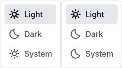 That’s why we need both icons and show the appropriate one on browser color scheme changes.
ActionCable for instant updates on all devices/tabs
And now, for bonus points: instant updates on other tabs/browsers/devices. We’ll need an ActionCable channel:
bin/rails g channel UpdateWe’ll want separate channels for every user (so they only receive their own theme updates):
# app/channels/application_cable/connection.rb
module ApplicationCable
  class Connection < ActionCable::Connection::Base
    identified_by :current_user

    def connect
      self.current_user = find_verified_user
    end

    def disconnect
    end

    private def find_verified_user
      cookies.encrypted["session"]["account_id"] ||
        reject_unauthorized_connection
    end
  end
end
When they subscribe to the channel, we stream their updates:
# app/channels/update_channel.rb
class UpdateChannel < ApplicationCable::Channel
  def subscribed
    stream_for current_user
  end

  def unsubscribed
  end
end
In the Profile model, we add an after_update_commit:
# app/models/profile.rb
class Profile < ApplicationRecord
  after_update_commit :broadcast_update

  private

  def broadcast_update
     if saved_change_to_theme?
      UpdateChannel.broadcast_to(self.account_id, self.theme)
     end
  end
end
This will broadcast the new theme to every subscribed client. It’s important to put this in an after_update_commit callback, otherwise there would be a chance that the transaction is rolled back after we broadcast the change.
Now the only remaining part is the client-side channel implementation:
// app/javascript/channels/update_channel.js
import consumer from "channels/consumer"

consumer.subscriptions.create("UpdateChannel", {
    connected() {
    },

    disconnected() {
    },

    received(data) {
        switch (data) {
        case 'light':
            document.getElementById('theme-light').click();
            break;
        case 'dark':
            document.getElementById('theme-dark').click();
            break;
        default:
            document.getElementById('theme-system').click();
        }
    }
});
We must use the .click() method instead of .checked = true because the latter doesn’t fire the event listener and we need that to update the page.
And that’s it, live updates are … live!
Thanks for reading! If you have any comments, additions, or corrections, feel free to reach me via e-mail.